Swiss Style forever – the story of a graphic design tradition
Conceptual strength, concision and technical precision: these are the hallmarks of Swiss graphic design and typography, which enjoy an excellent reputation around the world. They are the result of a long tradition of vocational education and training and professional excellence. Under the 'Swiss Style' label, Swiss graphic design gained international recognition in the 1950s and 1960s and became a highly successful export product. Read on to learn about the origins of Swiss Style – and why it never goes out of style.
A new profession
The profession of graphic designer did not exist at the turn of the 20th century. Posters and magazine titles were generally designed by artists, for whom such commissioned work was a way to pay the bills. Specialist printing shops did the layout for books, brochures and other printed materials. The first courses in 'applied graphic design' – including typeface design – were taught at vocational arts and crafts schools in Basel and Zurich from 1915. Graphic design courses were later taught throughout Switzerland as part of the dual vocational education and training system. There were two types of graphic design apprenticeships: one combining classroom learning with practical workshop activities and an in-company VET apprenticeship with supplementary classroom and workshop activities. Students who wanted to learn graphic design first had to take a pre-vocational course, which existed before the preliminary course taught at the Bauhaus School and which still exists in a modern form today.

Leap into modernity
The Swiss Werkbund (Schweizerischer Werkbund), founded in 1913 on the German model, provided a major impetus for the development of the Swiss printing and graphic industry. Its mission was to improve the technical and design quality as well as the marketing of Swiss products. In the 1920s the Swiss Werkbund promoted functional industrial design and, in close association with the Zurich School of Arts and Crafts, contributed to the development of modern graphic design. One of its co-founders was Ernst Keller, head of the Zurich graphic design programme from 1920 to 1956. A number of Keller's students would gain international renown, most notably the typeface designer Hans Eduard Meier (who developed the Syntax typeface), and the graphic designers Richard Paul Lohse, Hermann Eidenbenz and Lora Lamm, who developed unique styles of their own. The Basel School of Arts and Crafts (Allgemeine Gewerbeschule Basel) brought forth an even greater diversity of design styles.

Constructive Swiss graphic design takes roots
Illustrative graphic design was still widely used for advertising posters for the consumer market, but constructive graphic design came to dominate all other media: publications, word marks, logos, etc. The constructive Swiss graphic designers were more skilled at doing typographic work, layouts and photomontage than the illustrators with their pencils and brushes were. Improvements in photo print quality also paved the way. Richard Paul Lohse and the copywriter Hans Neuburg met the Bochum-based industrial graphic artist Anton Stankowski at the Zurich advertising agency Max Dalang around 1929, and learned the art of photomontage from him. Building on Stankowski's methods and European constructivism, by the middle of the century Lohse, Neuburg and their Zurich-based colleague Max Bill had developed an independent, austere style of graphic design committed to what they called 'concrete art'. Max Bill also created the first true layout grid system in the late 1930s.

2. Richard Paul Lohse, Geld – Roman der Währungen (Money - Novel of currencies) by Jean Mussard, book cover, Jean Christophe-Verlag, Zurich, 1938, letterpress, Museum für Gestaltung Zürich, graphics collection, © Richard Paul Lohse Foundation / ProLitteris
Swiss style – a Swiss export hit
Swiss graphic design and typography achieved international renown in the 1950s and 1960s. The two main centres were Basel and Zurich. Armin Hofmann and Emil Ruder, two influential teachers at the Basel School of Design, published textbooks that were read worldwide. In Zurich, Lohse, Neuburg, Josef Müller-Brockmann and Carlo Vivarelli published their acclaimed trilingual journal Neue Grafik (New Graphic Design). The work of these designers, which came to be known internationally as the 'Swiss Style', was characterised by a design language reduced to its essentials, the use of photography and graphic symbols, sparing utilisation of colour, sans serif fonts and asymmetrical layouts. Whereas the Zurich-based designers championed the use of a layout grid and the Helvetica typeface developed by Max Miedinger, Basel-based designers used layout grids more selectively and favoured Adrian Frutiger's Univers typeface. Both typefaces were launched on the market in 1957 and became export hits. Swiss Style won international acclaim for its clarity and apparent ease of use at a time when companies were increasingly demanding effective, functional and precise visual communication.
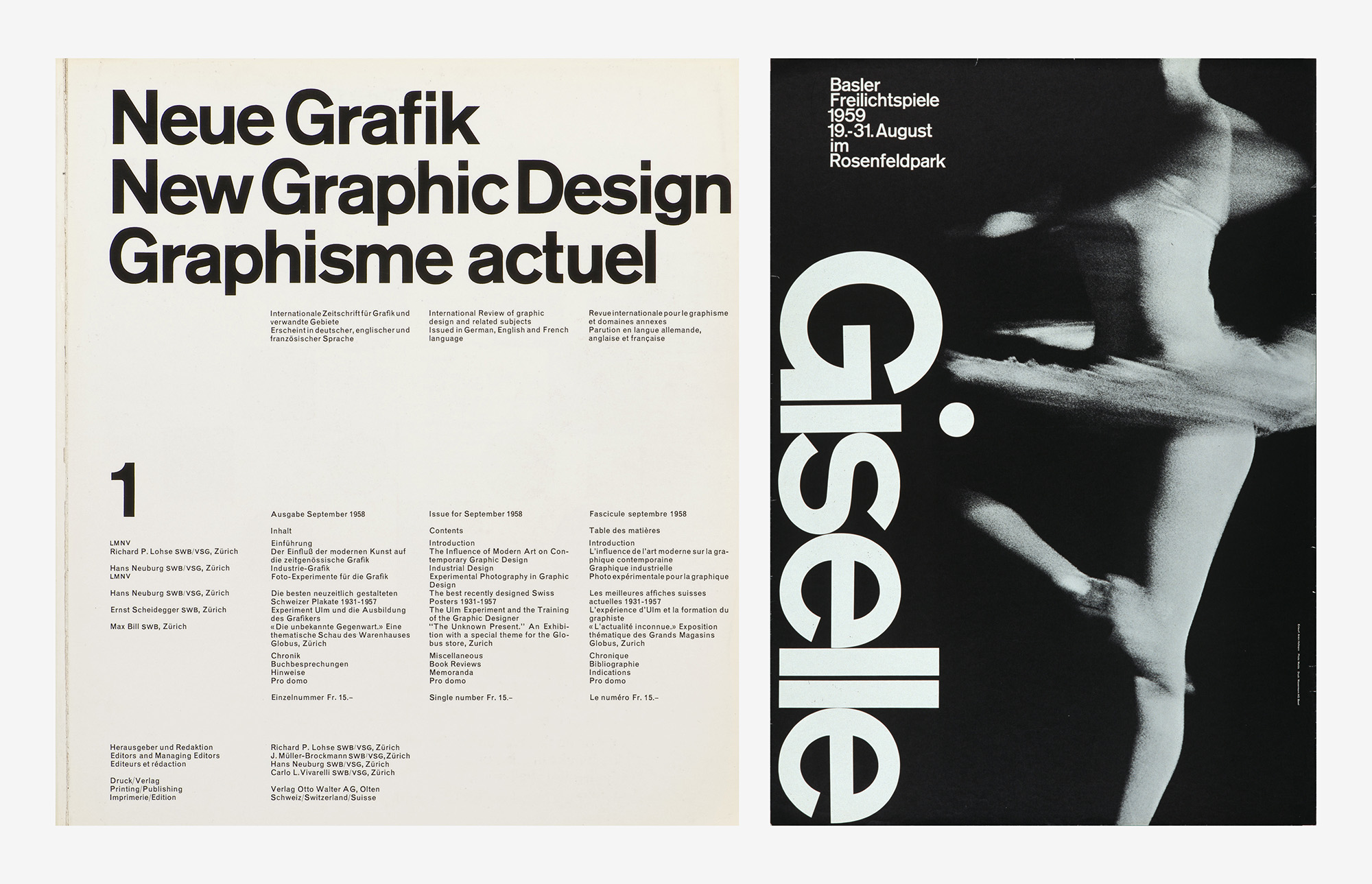
2. Armin Hofmann, Giselle – Basler Freilichtspiele (Basel Open Air Theatre), poster, 1959, offset, photo: Paul Merkle, Museum für Gestaltung Zürich, poster collection, © Matthias Hofmann, Lucerne
Constructive heritage
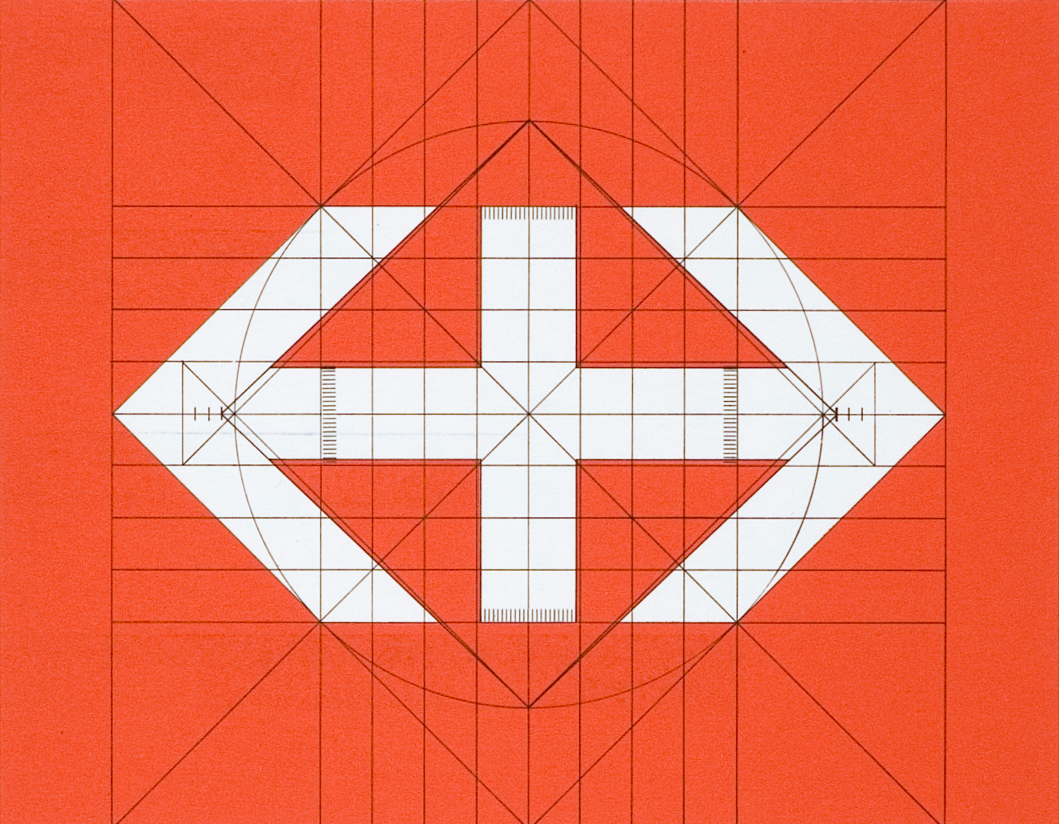
Swiss Style is much more than a style: it is a timeless Swiss classic based on a rational attitude and a methodical – even mathematical – approach. The visual information system designed by Müller-Brockmann and Peter Spalinger from 1978 onwards for the Swiss Federal Railways (SBB) is a good example of this. Its modular design and clear appearance make it as effective as ever. The same can be said of the SBB logo: the white double-arrow cross against a red background, symbolising the Swiss national flag, has become a distinctive trademark. Modern graphic design studios like Experimental Jetset, Norm, Julia Born and Laurenz Brunner value the advantages of crystal-clear Swiss typefaces, which they use to create their own projects. And not just graphic design studios: complex corporate images, information charts and signage systems draw on this constructive graphic design heritage.
Cover image: Josef Müller-Brockmann studio, Schindler Speedwalk Rollteppich (Schindler Speedwalk moving walkway), advertising brochure, ca. 1962, Schindler & Cie. lift and electric motor factory, Ebikon, © Museum für Gestaltung Zürich, Graphics collection / ZHdK / ProLitteris
Lead image: Photography class, Kunstgewerbeschule Zürich, graphic design class, Zurich School of Arts and Crafts, 1930s, photo: © ZHdK, Archive of the Zurich University of the Arts